Dashboard Walkthrough
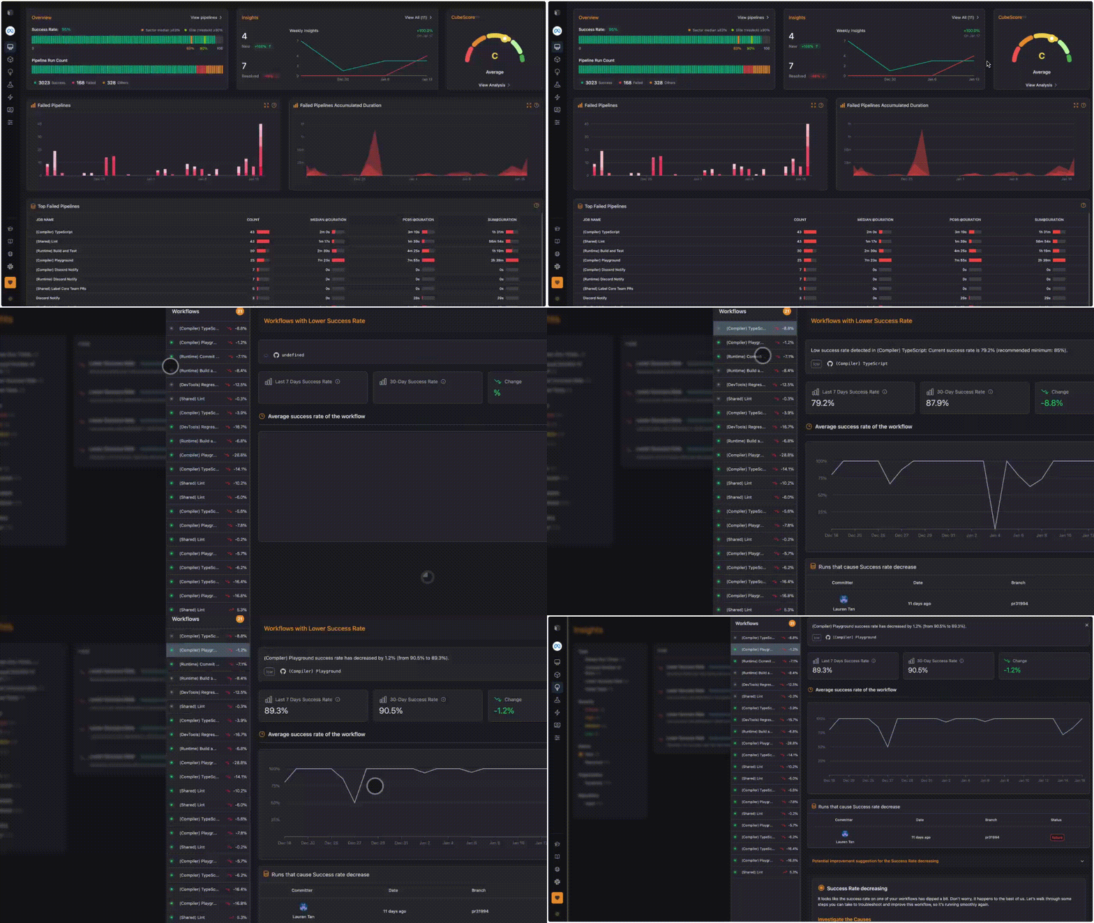
Once you're connected with your repositories, the dashboard provides a clear overview of your continuous integration pipeline’s performance, allowing you to see key metrics, current issues, and performance trends at a glance
Here’s a quick breakdown of each section:
CubeScore™ Indicator
The CubeScore™ is a visual gauge of your overall CI health, rated from poor to excellent on an A-to-E scale. This score is based on critical metrics like MTTR, Success Rate, Duration, and Throughput, providing a quick snapshot of your pipeline's efficiency.

Insights
The dashboard also lists specific actionable insights, which may be rule-based, such as "Success Rate Trend: Decreasing" or "Duration Trend: Increasing.". Each insight is labeled with a priority—such as high—indicating which areas need immediate attention to fully optimize pipeline performance.

Failed Pipelines Charts
Provides graphs and tables to get a better understanding of your failed pipeline details.

- Failed Pipelines: A line chart displays the frequency of pipeline failures over time, helping you identify any upward trends in failures and take corrective action on root causes.
- Failed Pipelines Accumulated Duration: Tracks the total hours accumulated due to failed pipelines over time, offering insights into potential time lost.
Top Failed Pipelines
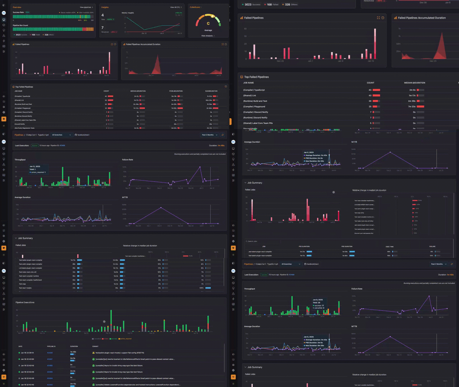
The table shows the top pipelines by failure count, along with median duration, P95 duration, and total failed time.

Clicking into a specific pipeline directs you to a detailed view of recent runs for that pipeline. This detail page is designed to support quick troubleshooting by allowing teams to identify the exact step causing failures and to review historical performance for each pipeline.
Pipeline Duration Analysis

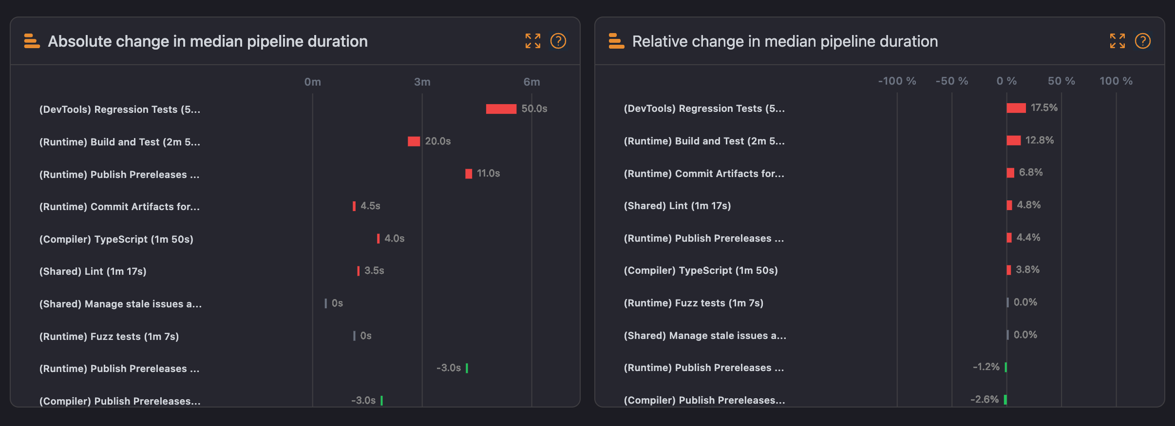
- Absolute Change in Median Pipeline Duration: Displays the absolute change in duration for pipelines, highlighting which pipelines have experienced the most significant increase or decrease in median duration.
- Relative Change in Median Pipeline Duration: Compares duration changes relative to previous performance, providing insights into evolving trends and patterns over time.
Top Slowest Jobs
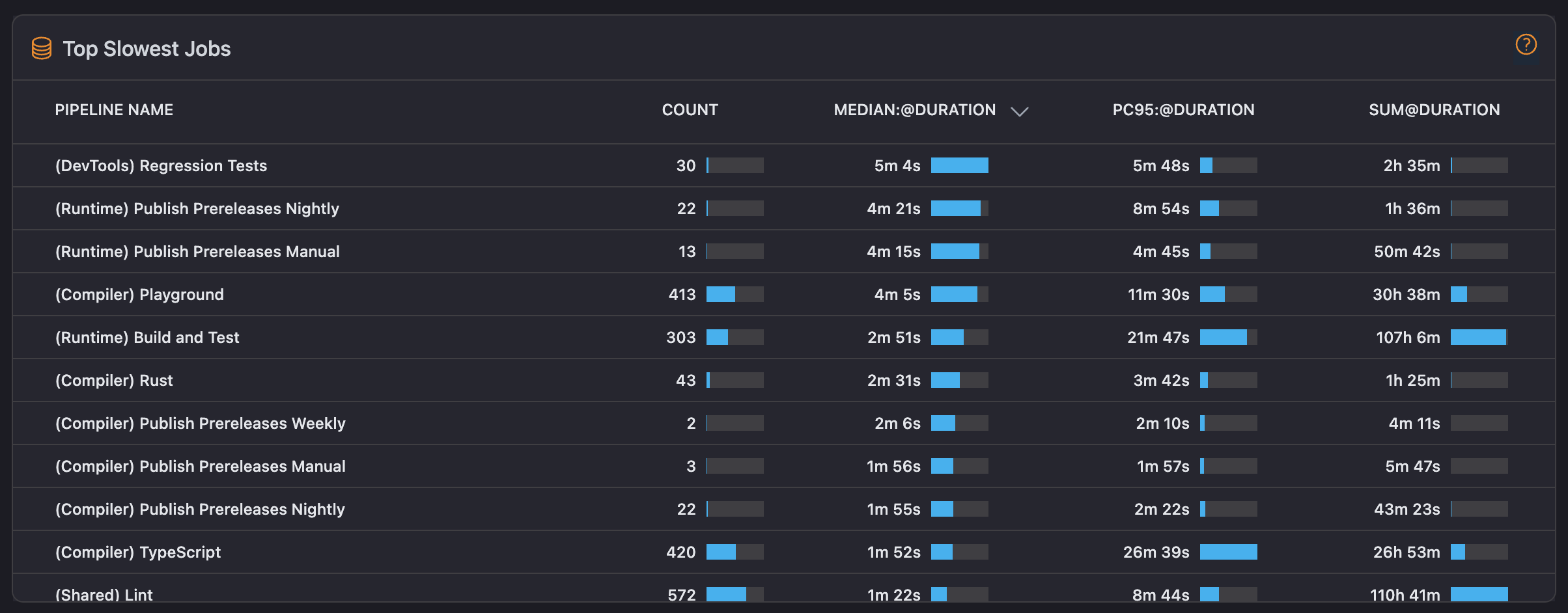
This section lists jobs sorted by their median duration, indicating how long each job takes on average. It includes additional details like P95 duration and sum of durations, helping you identify the jobs that consume the most time and may be impacting overall pipeline efficiency.

Clicking an item in the Top Failed Pipelines table opens its detail page, similar to the previous table.
Pipeline Executions
A bar chart shows the frequency of pipeline executions over time, allowing you to observe activity levels and workload trends within your CI workflows.

Each section of the dashboard is designed to provide DevOps teams with a concise, data-focused view of their CI pipeline health, supporting proactive monitoring and rapid optimizations.