Median Pipelines Durations
These charts go way beyond data visualization to actually empowering the teams to act upon them. By combining the insights coming out of Absolute Change and Relative Change, DevOps teams will be empowered to:
- Efficient Debugging: Focus quickly on the pipelines containing the largest duration increases, for efficient investigation.
- Faster Delivery Cycles: Reducing the length of pipelines improves feedback loops that then enable faster deployments.
- Improved Communication: Utilize the visual clarity of these charts to explain issues and solutions to stakeholders, both technical and non-technical.
- Data-Driven Decisions: Merge duration data with other performance indicators such as failure and success rates to perform effective optimization.
This will equate to significant time & cost savings, faster deployments, and more reliable CI pipelines for large teams with complex pipelines. With these charts integrated into your daily work, you transform data into insights that help drive your team toward elite standards of performance in CI.
- Set Alerts: Configure CICube so that in case there's a spike in threshold timings of your pipeline or whenever it starts getting bad, your team can identify well ahead of time.
- Benchmark Progress: Use the charts to set performance goals for pipelines and measure progress over time.
- Correlate Metrics: Link duration data with insights into flaky tests or resource utilization to gain a holistic view of pipeline health.
- Reviews: Incorporate these charts into your sprint planning and retrospective meetings.
Absolute Change Chart: Identifying Pipeline Trends
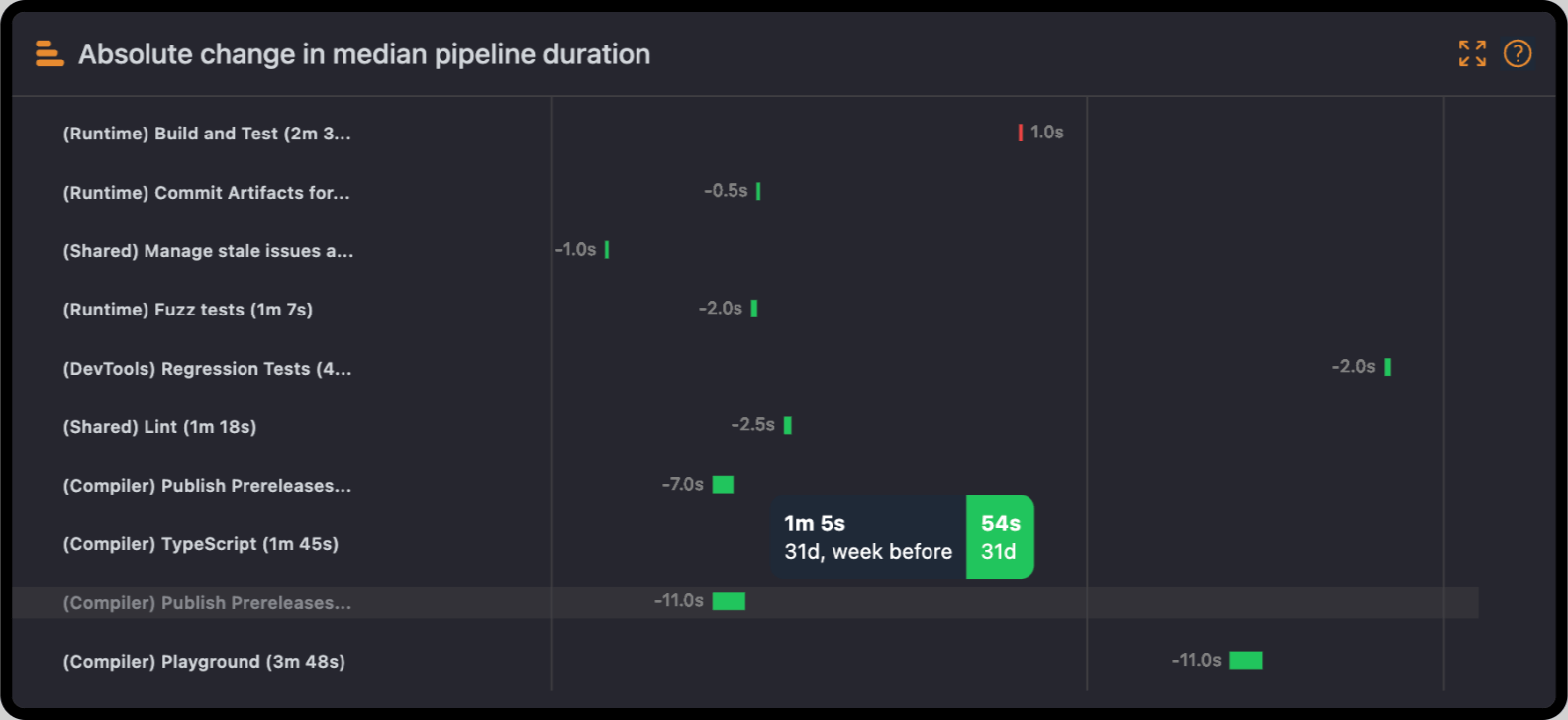
The Absolute Change chart displays the median of how your pipelines are changing over time. Each bar is a time deviation—positive or negative—that a pipeline or job occurred compared to its previous duration.
Why it matters:
- Pinpoint Significant Bottlenecks: When the duration of a pipeline has increased significantly, that will be highlighted on the chart, and the team can investigate the root cause right away.
- Improvement Efforts Tracking: Pipelines which have a reduction in duration prove optimizations like caching or parallelization.
- Historical Performance Analysis: View review duration over time, allowing you to contrast recent code changes, updates to the tool, and/or changes to workflow.
Real-World Scenario: Imagine you notice your "Build and Test" pipeline increased its median duration by 2 minutes. You drill down to find a poorly configured test step that's running longer than it is supposed to. You fix the step, and, with it, cut the duration, improving your overall workflow.
Relative Change Chart: Spotting Proportional Impacts
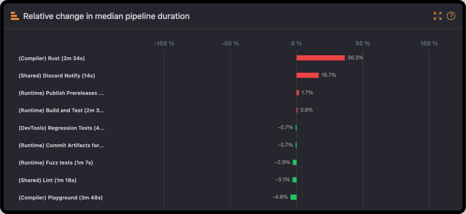
Whereas the Absolute Change chart underlines time variations at a specific date or period, the Relative Change chart shows changes in duration by percentages. This will easily allow the comparison of trends across pipelines, whether heavy in workload or duration.
Why it matters:
- Visualize Efficiency Gains: For example, a 20% reduction in the duration of a pipeline clearly indicates successful optimization.
- Compare Workflows: The greater the percentage increase of the pipelines, the more they indicate where debugging or more resources should be directed.
- Track Scaling Impacts: As workloads increase, this chart will help track how pipelines scale to demand and point out inefficiencies.
Real-World Scenario: With the shared cache enabled across your workflows, the Relative Change chart now displays that most of your pipelines have a 15% reduction in durations. This may be a quantifiable number to show to stakeholders where optimization efforts have been performed.
Monitoring Day to Day: Begin your day by studying these charts, which let you know about the most significant changes either in pipelines or jobs, so that teams may proactively identify inefficiencies before they start to affect delivery timelines.
Sprint Retrospectives: Use these charts to compare the pipeline durations at the start and end of a sprint. Highlight pipelines where improvements were made, or detect workflows that degraded over time.
Analysis of the Incident: After a pipeline failure, determine if it caused succeeding workflows to be longer. This helps in finding cascading issues or poorly optimized retry mechanisms.
Long-term Optimization: Track the trend of duration over months to see if improvements you introduce, such as parallelization, better resource allocation, or tool upgrades, have any impact.